Humble MeteorBack to selected work

Deadmark / Case study

Dead-simple image markup
for makers.

Concept · Identity · User experience · Interface · Build

A fragmented feedback process became an original product—with a clear identity, a focused workspace, and instructions ready to hand over.

Deadmark / From zero to one

The interface.
The instructions.
The whole experience.

Deadmark connects notes to the exact part of an image that needs attention, then turns them into a shareable feedback pack.

Created independently by Humble Meteor’s founder, the work spans product strategy, naming, brand identity, UX and UI, design systems, product copy, the application, and the launch site.
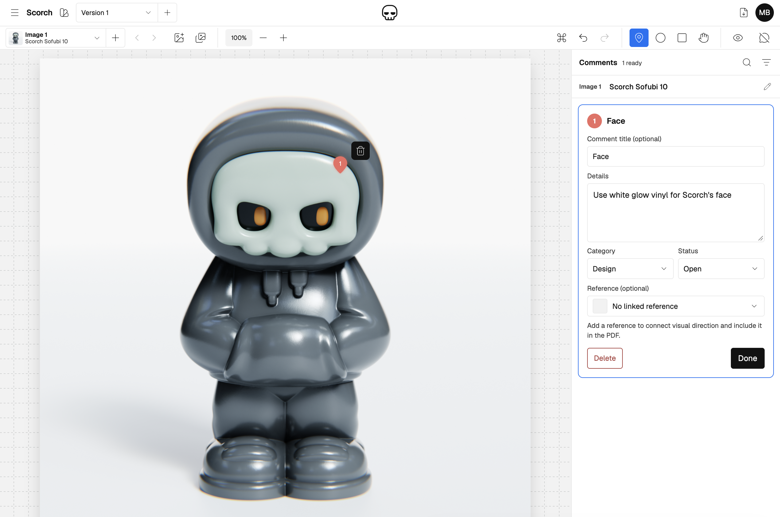
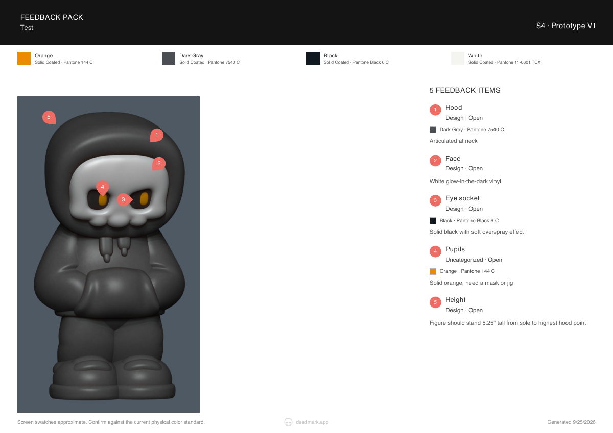
01 / Make it specificThe workspace
Deadmark workspace showing an annotation on Scorch’s face and the linked material instruction

A pin on the image. A clear instruction beside it.
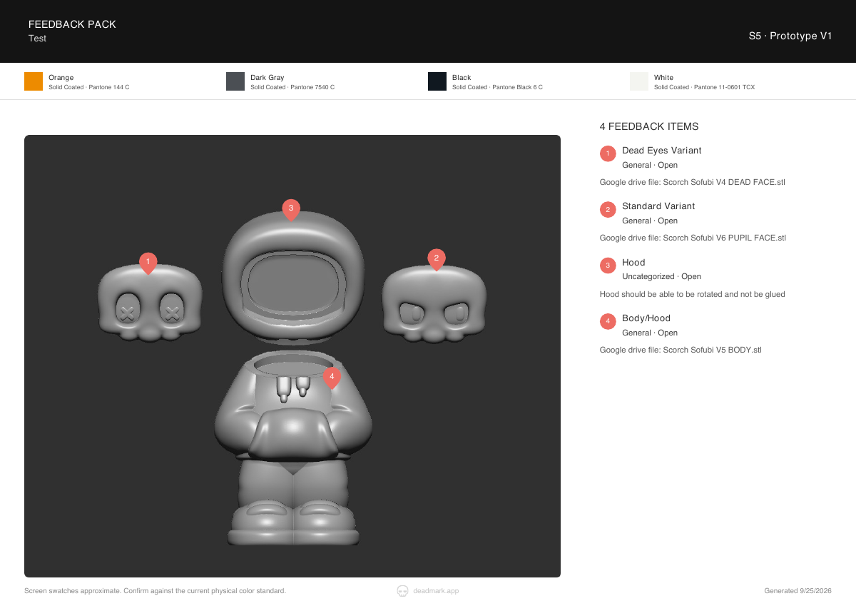
02 / Make it shareableThe output
Exported feedback page pairing numbered image annotations with material and production notes

The same feedback,
ready to hand over.
View sample PDF

A small change shouldn’t take five tools to explain.

The problem

Deadmark began with firsthand experience reviewing physical-product samples. An image, a marked-up screenshot, a written instruction, and a separate reference could all be needed to explain one change. As feedback moved between tools, the connections became harder to follow.

The opportunity was to keep the location, requested change, and reference together—from the first mark to the document someone receives.

Design the handoff, not another inbox.

Product strategy and scope

The MVP focuses on a one-way PDF handoff. One person authors the feedback in Deadmark; the recipient opens the document through email or messaging they already use. Both sides don’t need a new account to get value from the exchange.

Numbered marks connect images to instructions. References travel with the feedback. Written color specifications remain visible rather than relying on screen color alone. Live discussions and approval tracking were deliberately left outside the initial scope.

Give the image its space back.

Interface and interaction design

Early versions crowded the canvas with navigation and repeated controls. A compact header, asset dropdowns, and an overlay project drawer made more room for the image. Comments retained their own panel because reading and editing them is part of the central task.

Point pins, movable regions, and working resize handles make it possible to mark exactly what needs attention. Neutral comment fields and project-specific categories replaced factory-only language, opening up the workflow to other creative work without assuming that broader demand has already been proven.

Deadmark interface with image markup and an editable feedback panel
The current workspace keeps image markup and editable feedback side by side.

Trust comes from what the product does.

Saving, recovery, and the exported document

A reassuring “Last saved” label wasn’t enough if an unfinished comment could disappear. The requirement became preserving work: completed marks create recoverable drafts, comment text saves after a short typing pause, and Done closes the editor rather than acting as a save gate.

Incomplete drafts stay in the workspace but out of the PDF. Recoverable Trash separates routine cleanup from permanent deletion. In the final document, reference thumbnails sit beside their instructions and link to the appendix. The recipient’s experience is part of the product.

Character in the brand. Clarity in the product.

Identity, messaging, and launch

“Death to revision hell” gave Deadmark its attitude. The skull-led identity directs that energy at tedious work, while the application stays restrained so images and instructions take priority.

The launch experience explains a simple sequence: mark an image, add notes and references, export a PDF. A recorded demonstration and sample document show the workflow. Subscription strategy and the paid-entry experience were designed alongside the product, rather than added as a separate exercise.

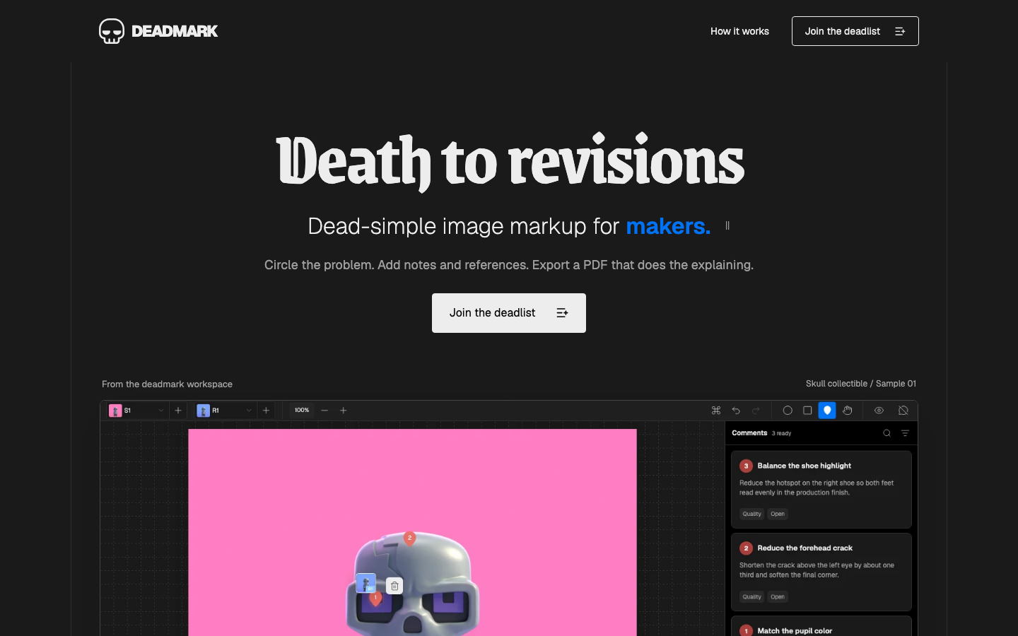
Deadmark launch-page design connecting its visual identity to the product workflow
Brand identity and product messaging carried into the launch experience.

Built, launched—and still being validated.

What exists today

The authoring and PDF-export MVP is working, and the public waitlist launched in September 2026. Product strategy, identity, interface design, the application, and launch materials form one connected body of work.

Paid onboarding and customer validation remain in progress. The next questions are whether creators can prepare a sendable document unaided, whether recipients understand it without clarification, and whether repeat use supports a subscription. These are next steps, not claimed customer results.

Visit Deadmark
Talk about your project